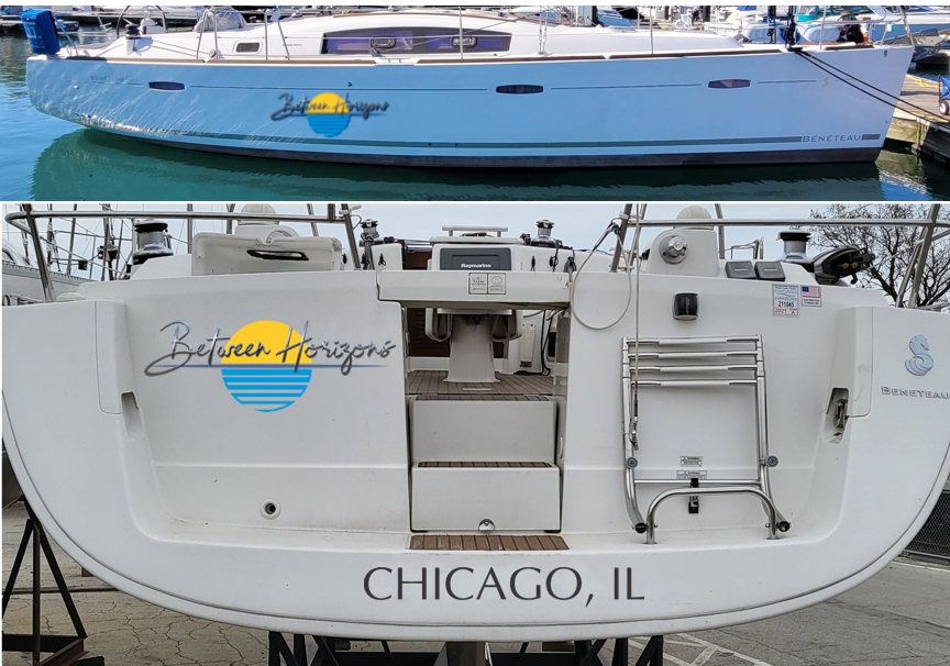
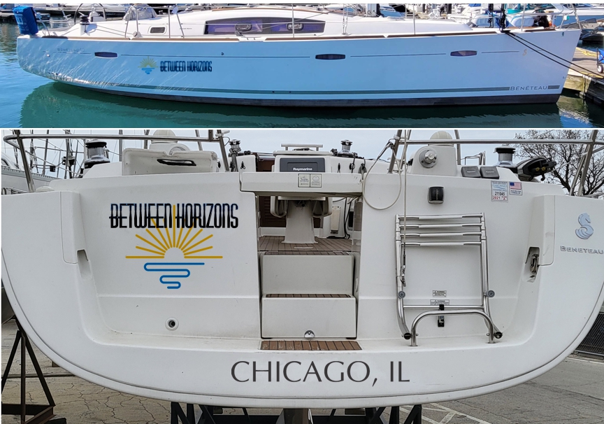
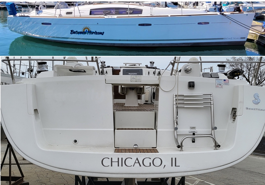
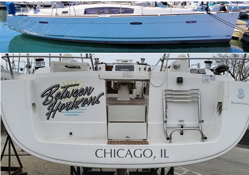
First impression would be that if this is a documented vessel the name that fits on the transom may not be large enough which drives me to consider a graphic for port and starboard sides. These can be rearranged and presented in a more square aspect ratio for use on a shirt, (as we see in #2 on the transom) but my primary focus would be the legal boat markings first and shirt design second.
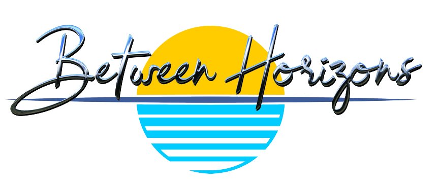

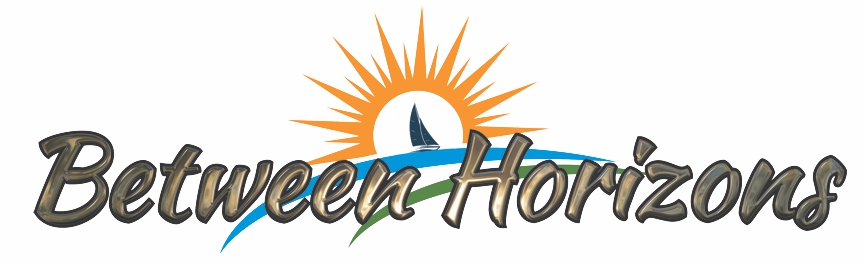
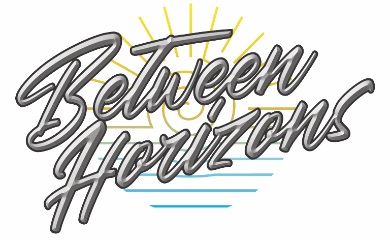
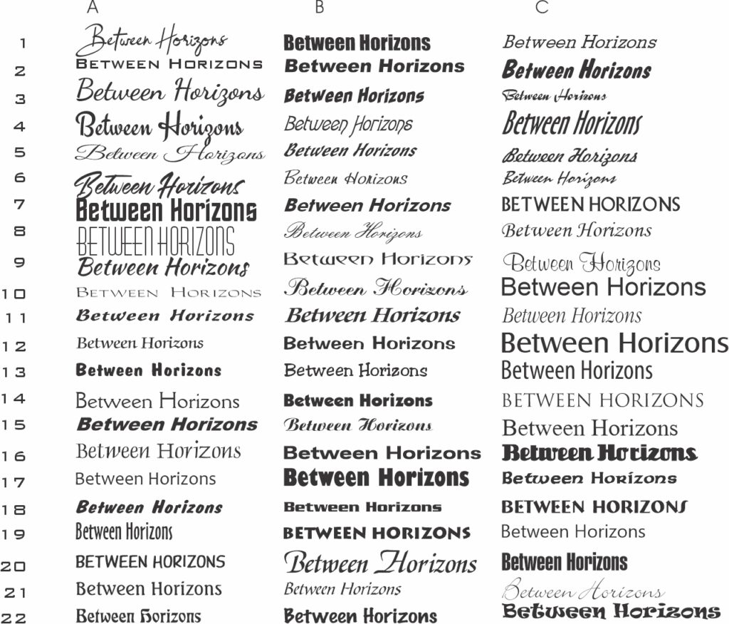
I start with a type study to look for interesting letter pairs. Then I pick my favorites for first drafts. At this point just looking for shapes, readability and then how to incorporate a logo. All the elements are variable, so if you see something you like from the first and third ideas we just swap things around for additional iterations.