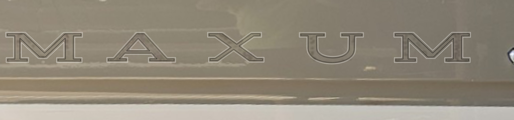
The image below shows the Maxum logo and how an additional contour, indicated in white, would thicken the typeface and help cover the discoloration left behind when the original graphics were removed. We would cut this in black.
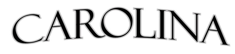
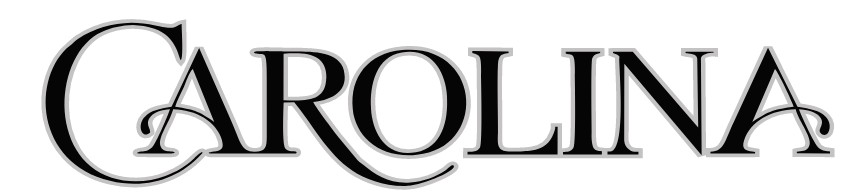
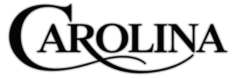
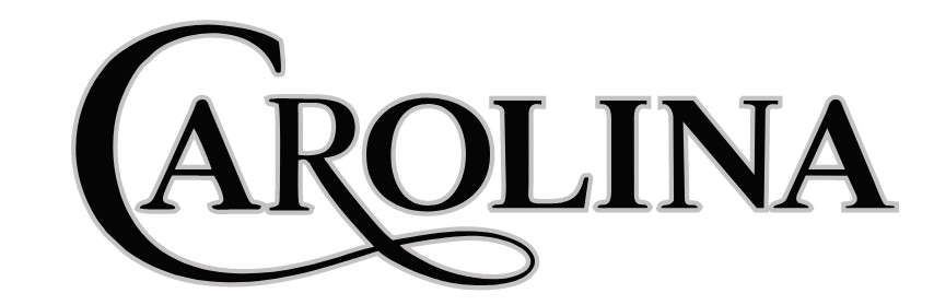
Designing a great boat name graphic starts with experimentation. I begin by placing your name into 66 different typefaces to see how it looks across a wide range of styles—classic, modern, bold, elegant, and everything in between. This quick exploration helps identify the most promising directions. From there, I develop my favorite four best concepts into finished graphics so you can clearly see which style feels right when previewed in place on your boats photo.
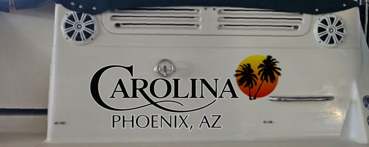
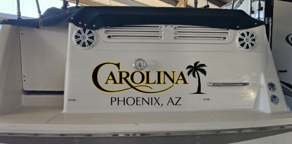
Here are my four favorite design concepts for starters. Each is shown as a graphic and as a preview for possible scale and position on your transom. The image title briefly describes the style. Next steps – we can modify these designs, mix elements from different ones—such as the colors from one and the typeface from another—or explore a new direction, developing up to eight ideas if needed