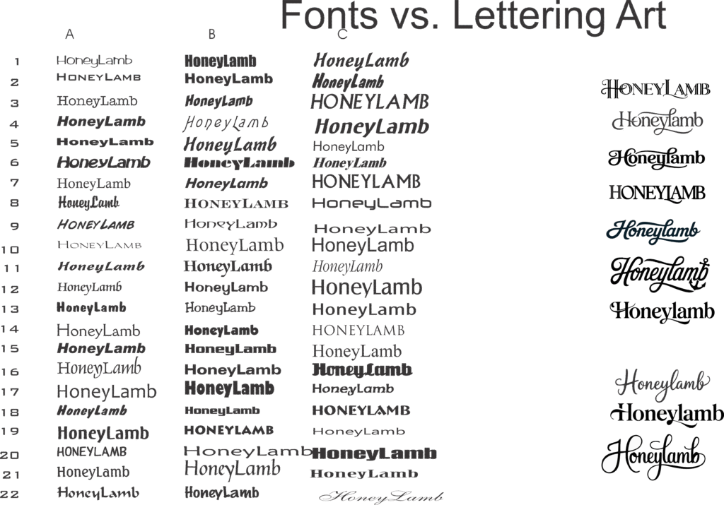
From just fonts to lettering art.
Creating lettering art begins with a thorough examination of fonts and their underlying structure. By studying a wide range of typefaces — including serif, sans-serif, script, and decorative — you begin to understand the rhythm, weight, and spacing that give each font its unique voice. Special attention is paid to letter pairings, known as kerning pairs, to identify where creative enhancements can elevate the design, such as extending a tail, interlocking shapes, or balancing negative space. These pairs often reveal natural flow points or visual tension that, when emphasized, transform ordinary text into expressive artwork. Through experimentation, the foundation for original, stylized lettering begins to take form.
Here we see there are opportunities to work with the H, Y, and L in Honeylamb. On the right are the results.

Next, we take that a step further by studying how each proposed graphic fits on the boat’s hull in relation to hardware or door hinges, in this case. It’s good to see the hailing port position in this step as well.

Finally, if the style is suitable and chosen for further embellishment, we experiment with adding fill effects, outlines, shadows etc. Here the first example is shown with a gold inlay and subtle gray drop shadow.

