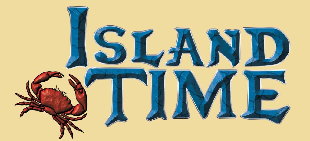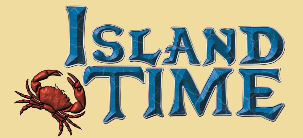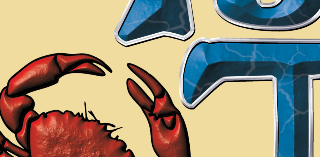
The original Adventure Time letters inspire this impression. I’ve used a textured bevel instead of the more cartoonish rendering in the original. The same for the crab in 1, above it has a darker outline whereas in 2. below we see the crab with its original lighter outline which may be lost against the gel coat colors.