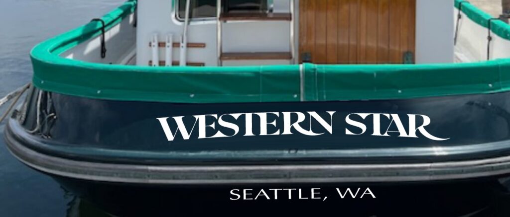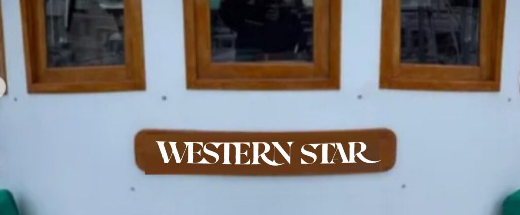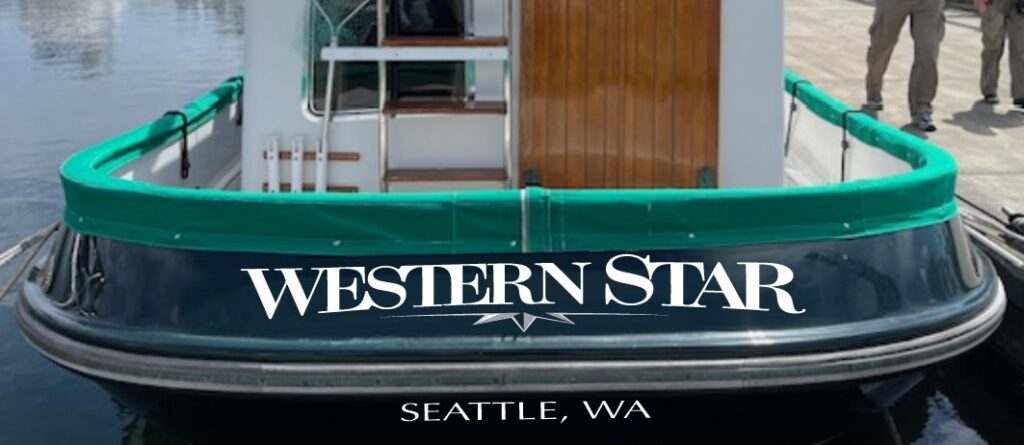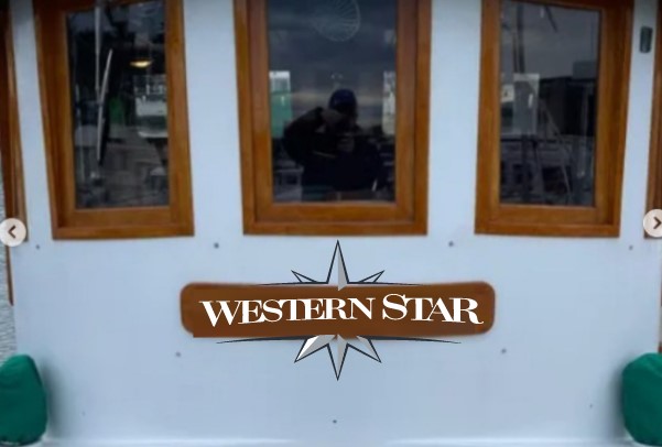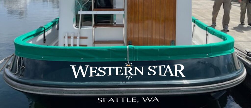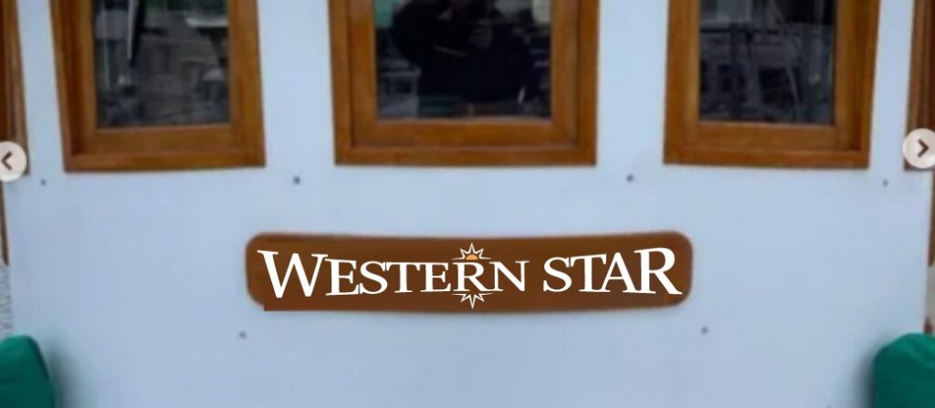
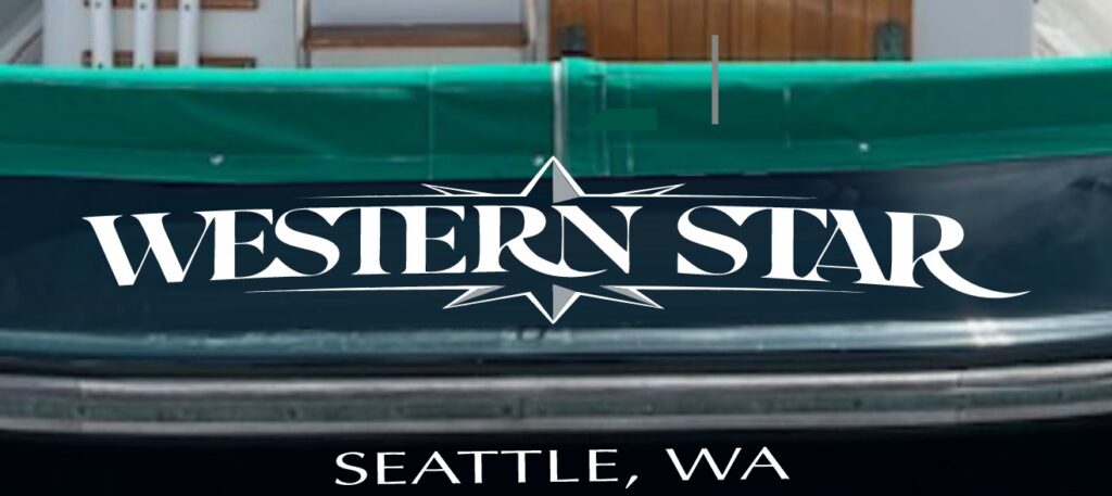
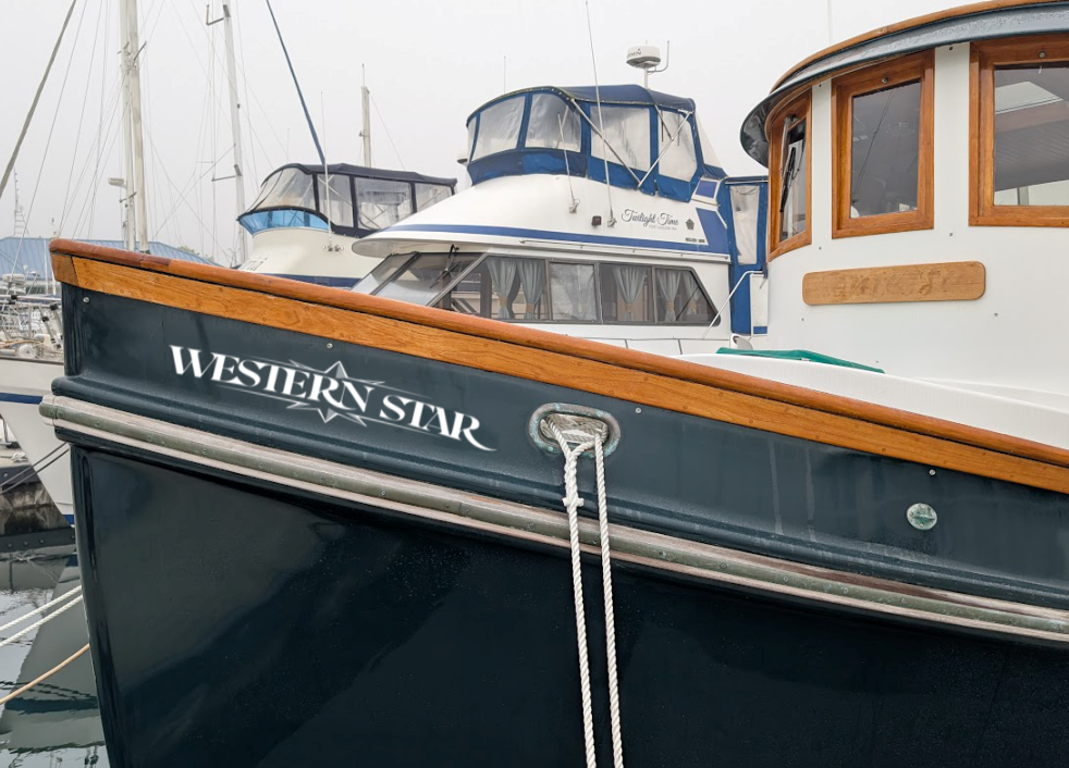
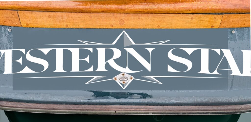
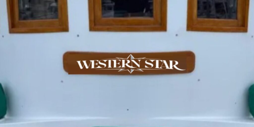
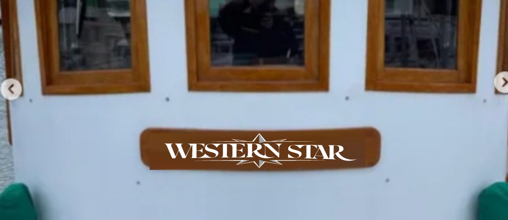
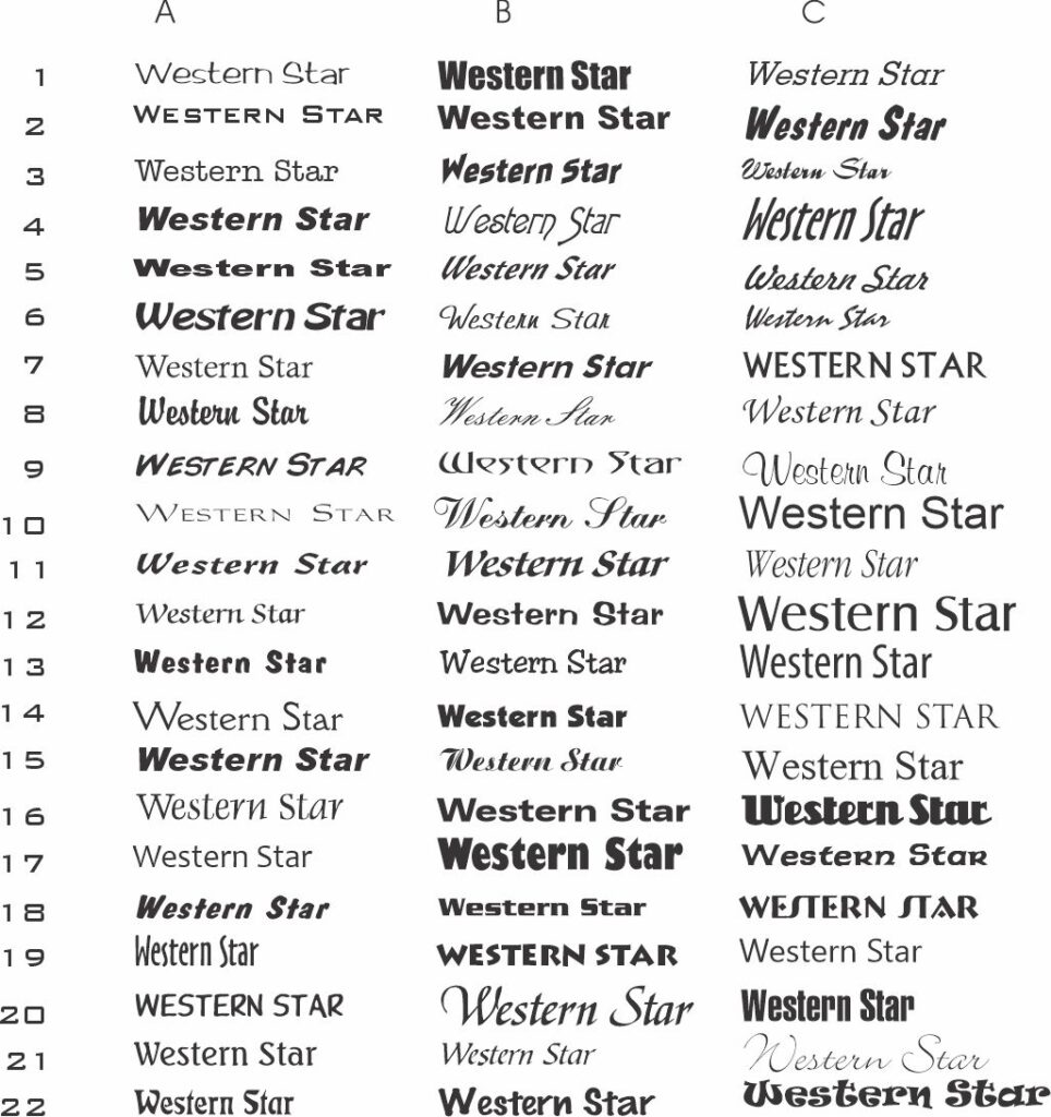
When I begin to think about a boat graphic, I like to start with a type study to get a general idea of how the letters relate to each other. Given the space available on the transom and the name board on the bow, I’m looking to lay this out horizontally. I picked some of my favorites for the first drafts, but you are welcome to ID some of these typefaces if you’d like to see them on the boat for comparison.
Check out more ideas below and let me know if you like one of these right off the bat, we can schedule an install during your San Juan County shakedown cruise. I’ve used whites and silver grays for contrast but gold looks good with green too. Let me know if you want to see digital print versions with bevel effects as well.