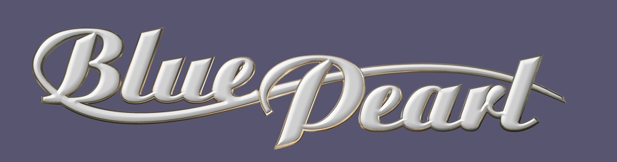
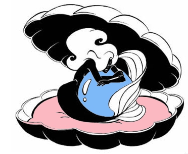
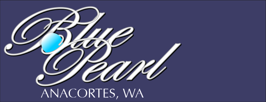
4. Hull preview4. gold foil overlay6. gold bevel chrome outline would also work as silver5. bright blue outline5. Centered on panel for name and boat for hailing port1. placement centered with hailing port below.1. light gray bevel with black outline shadow1. hull preview with hailing port in upper panel1. a different view of the hull previewMermaid with blue pearl in shell2. white version of #1 with mermaid in pearl shell (rough draft) with a blue pearl2. hull preview3. center position on transom with hailing port above rubrail3. hull preview with lettering centered above rub rail3. alternate position
3 comments
Hi John,
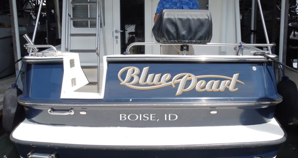
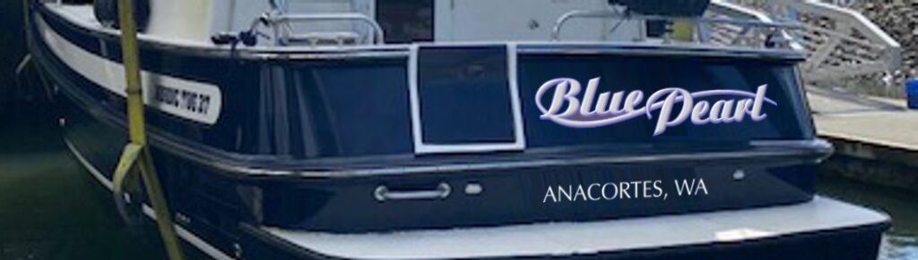
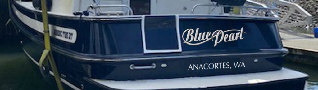
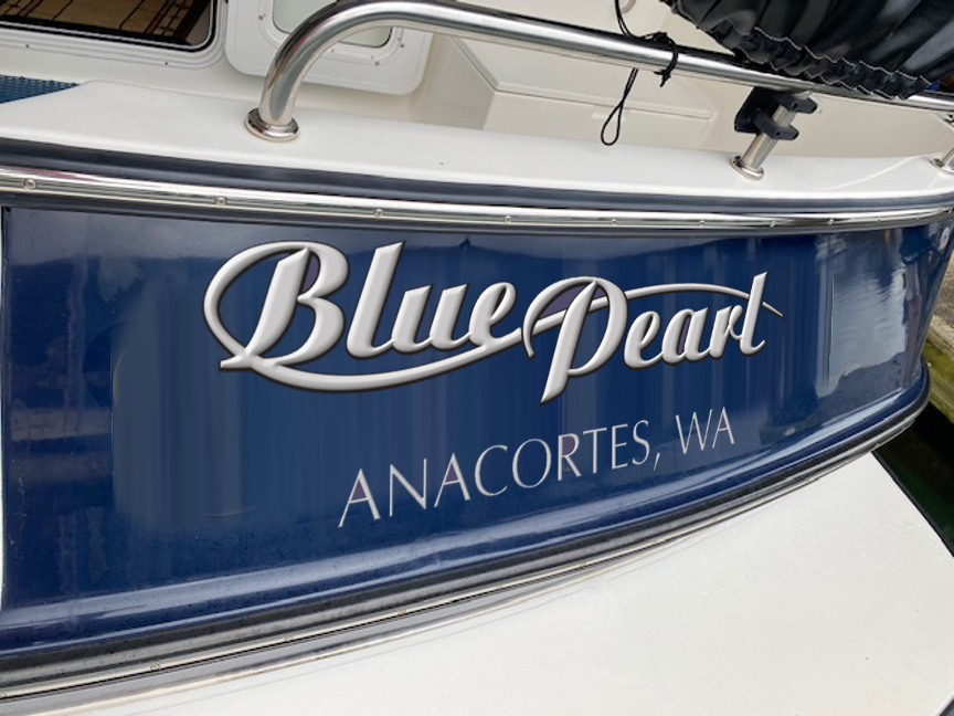
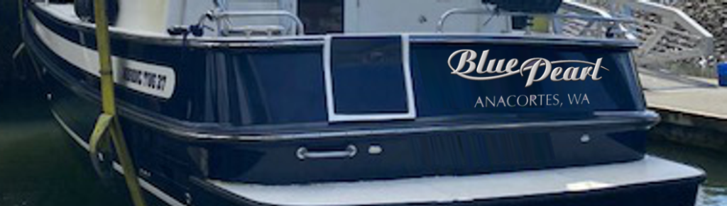
Lets go with version 1, which I think is font 5A, with text only. I like the grey bevel with the black outline and the connecting swoosh off the “B”. Let’s go with the hailing port; Boise, Idaho, below the rub rail as in #3 alternate position. Can we look at that design (1plus alt 3) and a couple of alternatives please. I am thinking of a different shadow outline, maybe something brighter and contrasting, super bright blue or yellow? Not sure if that will look good and it is likely we will stick with your original black.


Hi John,
Lets go with version 1, which I think is font 5A, with text only. I like the grey bevel with the black outline and the connecting swoosh off the “B”. Let’s go with the hailing port; Boise, Idaho, below the rub rail as in #3 alternate position. Can we look at that design (1plus alt 3) and a couple of alternatives please. I am thinking of a different shadow outline, maybe something brighter and contrasting, super bright blue or yellow? Not sure if that will look good and it is likely we will stick with your original black.
Milt
Hi John,
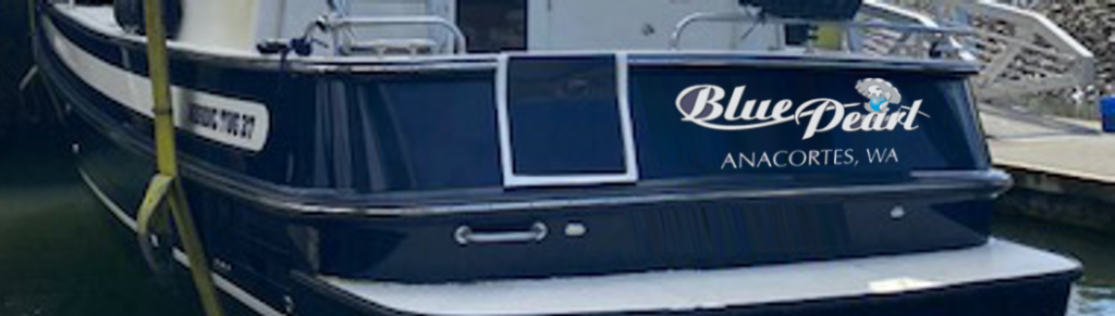
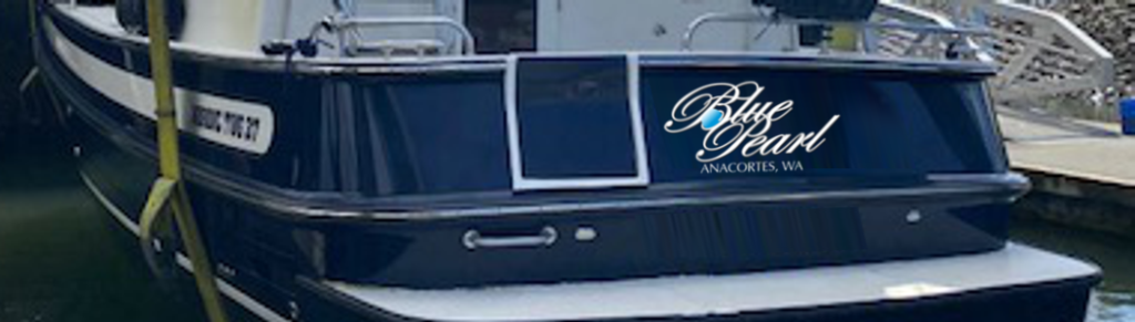
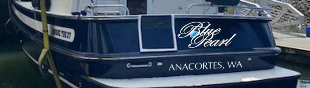
Let’s go with the gold foil overlay, #4. Look forward to the next iteration.
Gold foil overlay is the one!