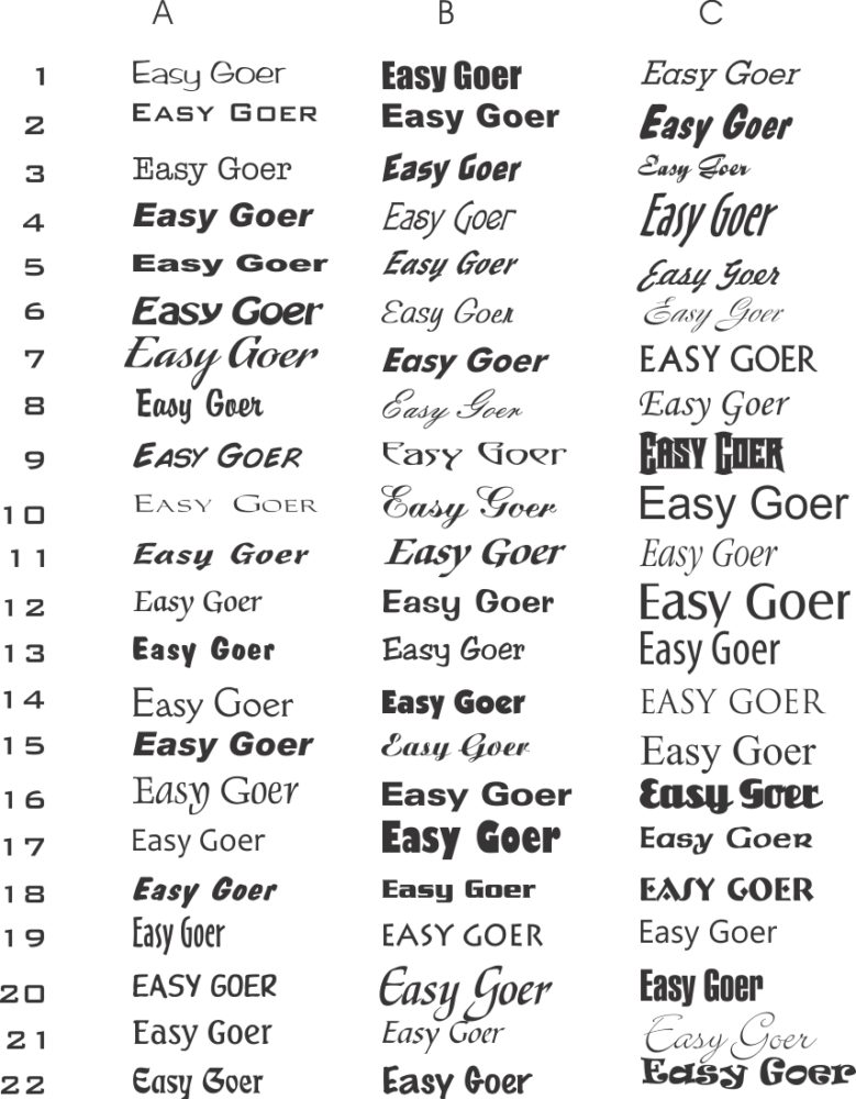
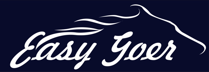
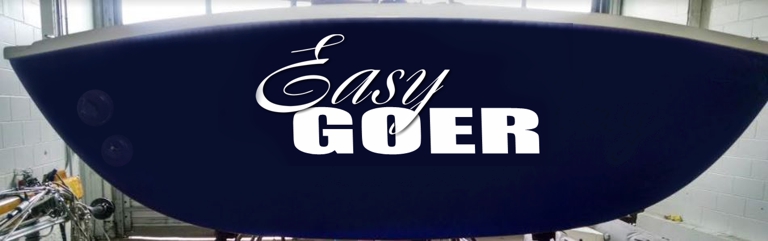
7. stretches out nicely, I would also put a shadow on the wave under the G
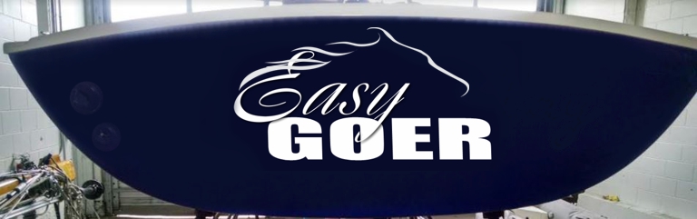
6. We’re on the same page three of the typestyles you requested are already in use, for example In your email you mention the fonts we see in #1, #2 and #4 so this is a version using one you like that we don’t see in this set yet, 11c.
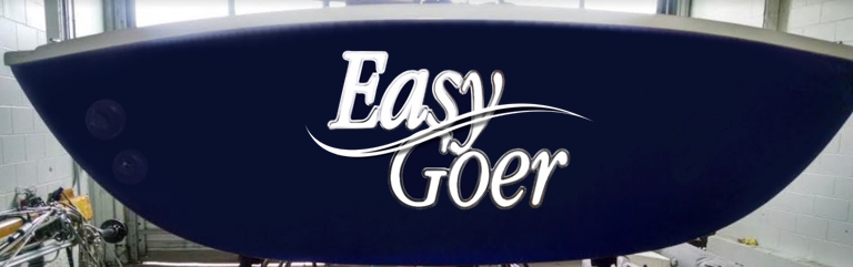
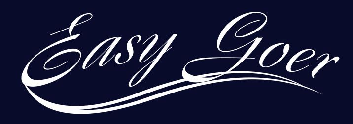
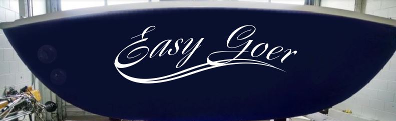
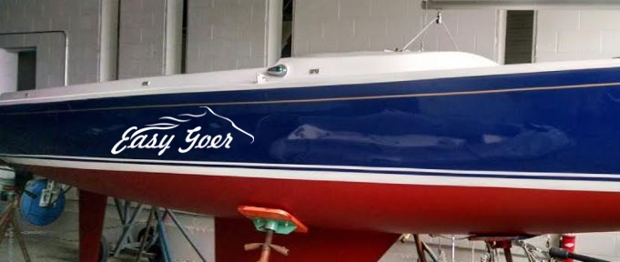
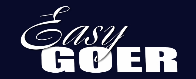
5. here is your top script choice 6c already in use for 1 and 3 for half the name. I didn’t prefer the cap “G” so this hit the scrap floor on my first drafts. I try to limit to 8 iterations and drive decisions that way. Do you prefer the horse or something like this wave better?
4.
3.

2.

1.
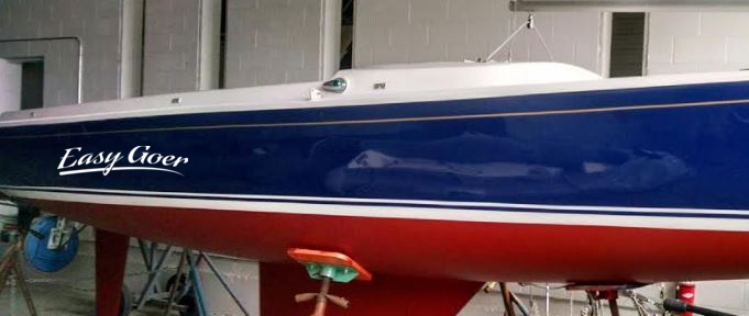
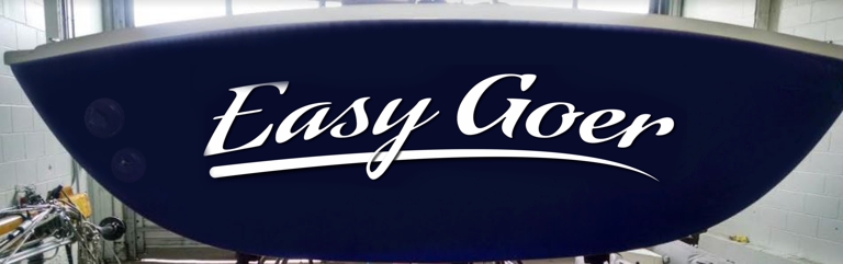
A type study of various styles focusing on script and how it can flow with this horse graphic I like. Review these initial ideas and comment either by email or in the comment section below.