8. A version on clear for the white areas of the hull.
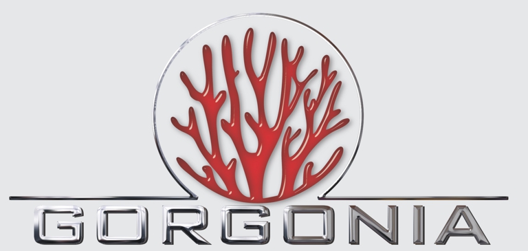
7. I think red might not pop as much as chrome against the gray, but wanted to show you. Seeing what you don’t like is good information too. I tried versions with the coral detail but they didn’t cut it for me.
6. I like the long layout as opposed to this stacked style. This might work for the cabin sides, or business cards, but the boat really screams for a longer layout like the next one.
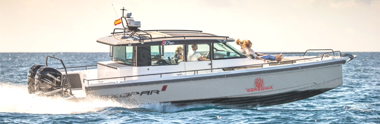
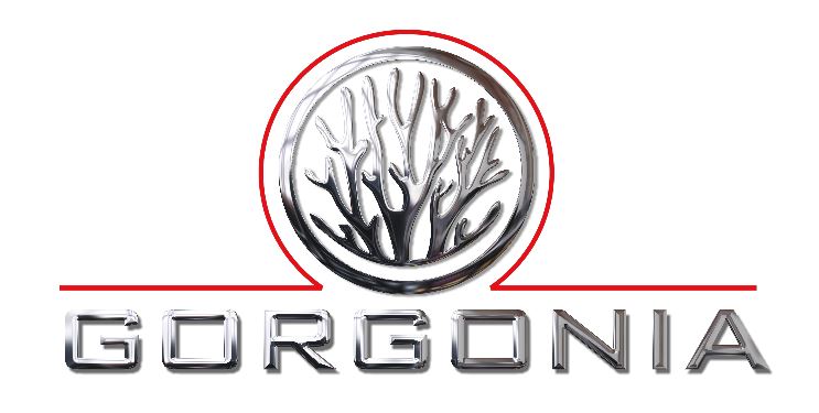
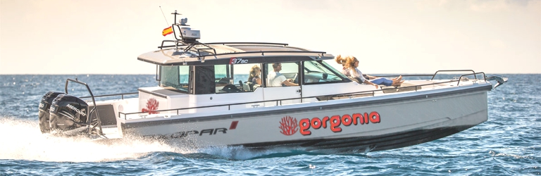
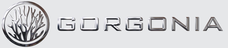
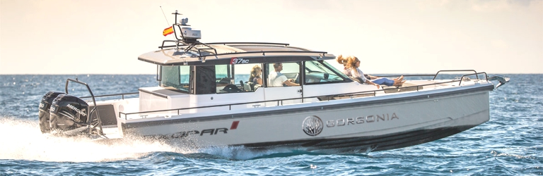
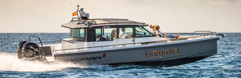
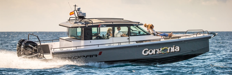
5. I like this clean line, simple layout. I would lighten the letters “gonia” which gets lets highlights than the first four. That would create better contrast and readability from a distance. The chrome logo by itself or in combination with the name would make for good markings on port and starboard side as your brand.
4. A variation on #2 using a gold leaf outline. The shadow effect would work on your gray, that part is printed on clear. The colorful corals would either have to be printed on white as a second layer. Some printers I use can lay down white ink first then print color over the white, which will be necessary if we’re placing the graphics on a gray background.
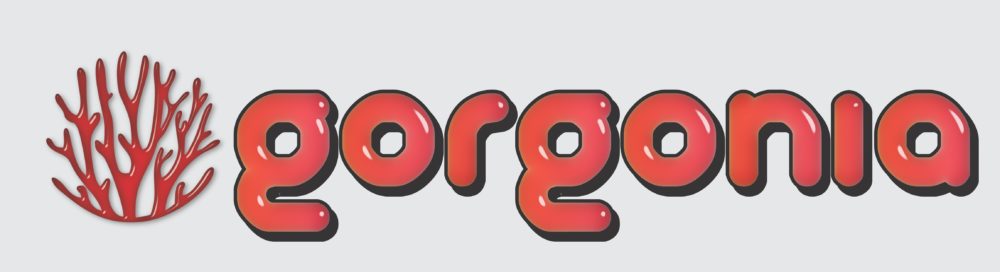
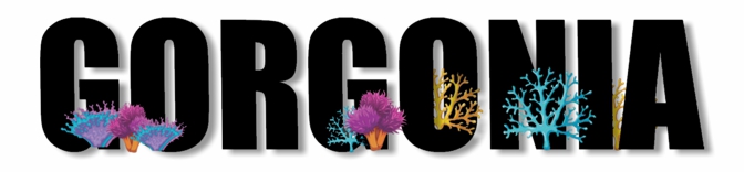
3. Using an illustration of corals as one of the o’s. These are just rough drafts. I didn’t spend a lot of time finessing the colors. The letter face here is an illustrated effect we’d print on white to knock out the gray hull.
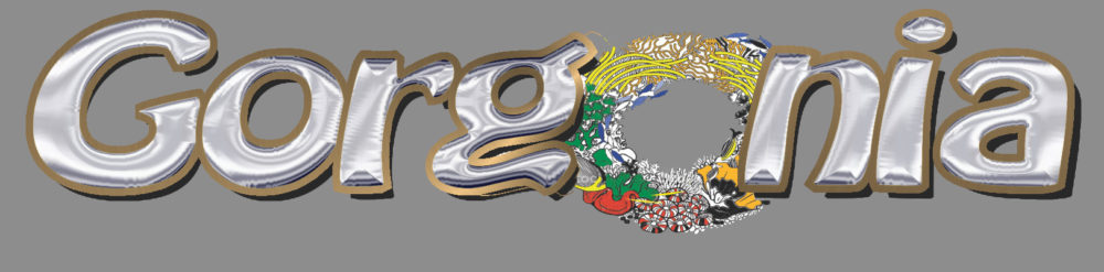
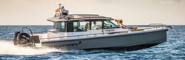
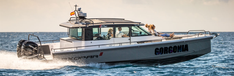
2. Digital print with corals growing around the letters. In this example I illustrate a silver bevel outline. This could also be filled with an acdtual silver leaf for some extra shine. I place it on the house here against white as an example.
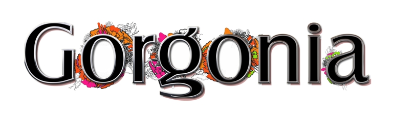
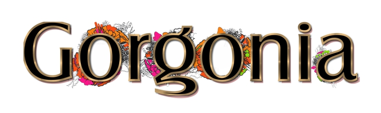
1. Colorful illustrations of corals growing from the base of bold black letters. Lots of contrast against the black.
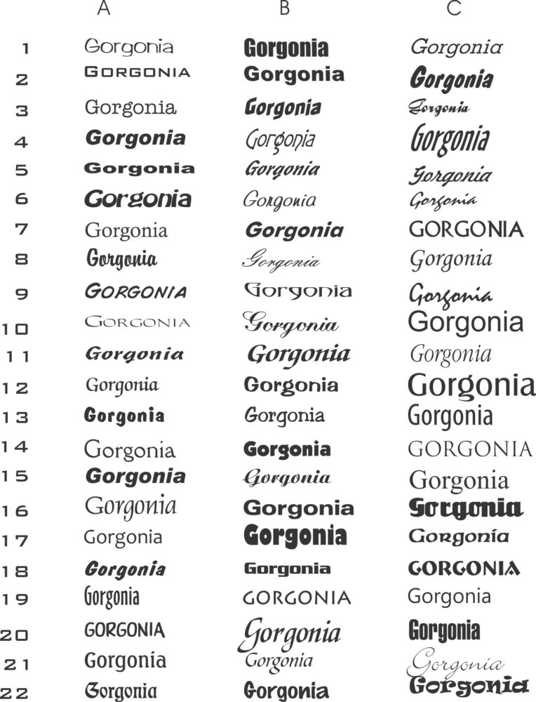
I usually begin with a type study and pick some favorites to rough out my first drafts. Let me know if you’d like to see new ideas using any of these fonts.