I’m Busy Too graphics

7. just with Dennis in red
6. with a little lineart for reference to the phrase.
6. preview on hull
5. Red bevel face with navy outline to pick up the hull color
5. close up
5. This is how the height looks straight on in that area, easily CG approved
4. traditional gold leaf or foil with digital soft shadow on clear to blend
4. hull preview
2. mounted port and starboard with hailing port
2. bevel with white highlights and a gold outline, wave weaving through
1. Simple one-color vinyl for transom, you could add white version to the sides as well
3. chrome bevel fill with slight black dropped shadow for transom
3. hull preview on transom

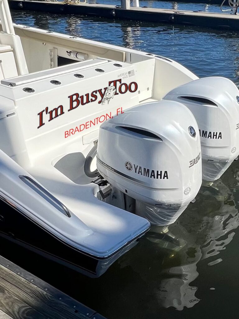
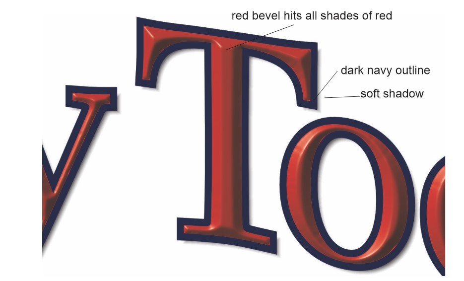
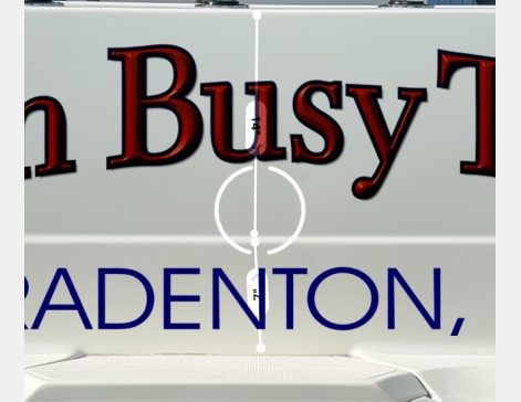
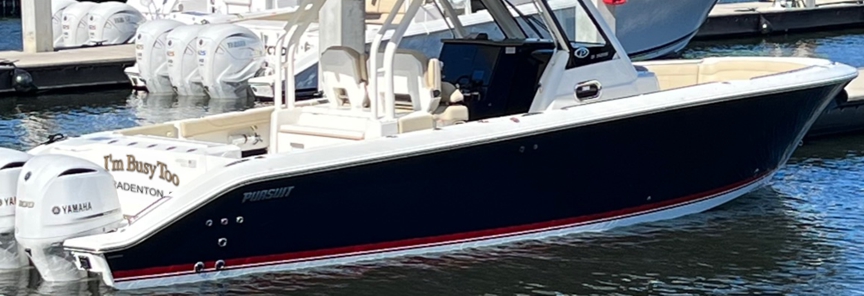
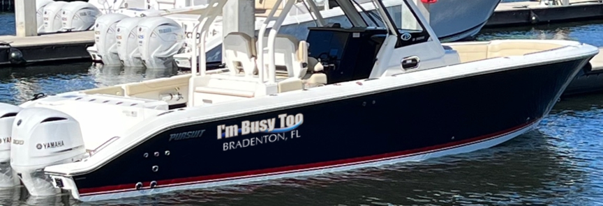
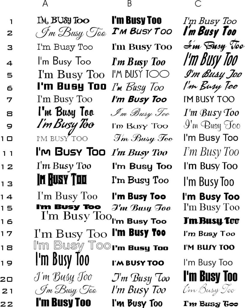
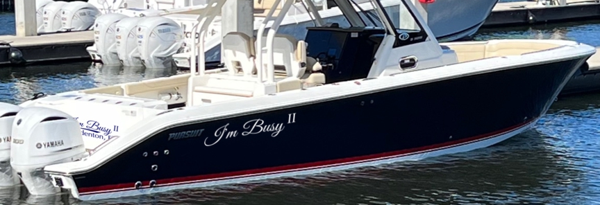
I start by looking at a variety of typefaces to identify ones that stand out to me. I’ve chosen my favorites, but if you see one you’d like me to try please let me know which row and column.

Leave a Reply

Your email address will not be published. Required fields are marked *