

A Doctor’s Nautical Escape
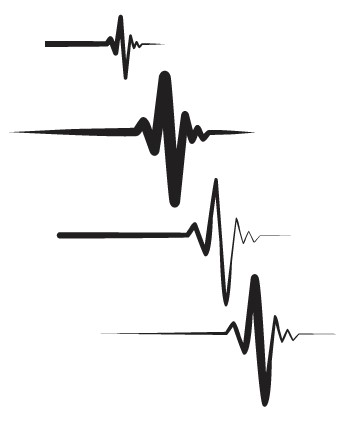
A standout feature of the “Knot on Call” boat graphic is its unique integration of an electrocardiogram (EKG) symbol in its design.
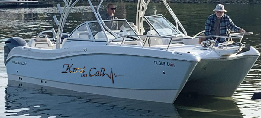
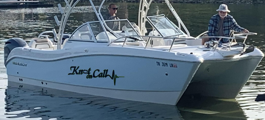
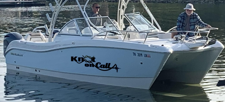
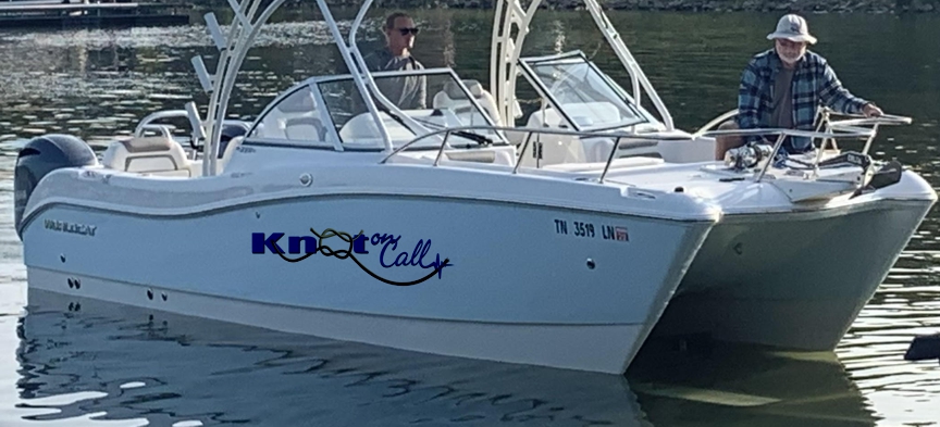
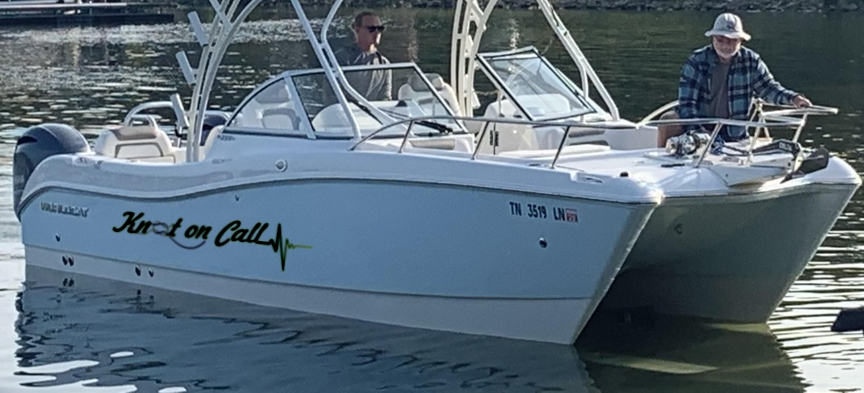
Below find some examples of variations recently for boats with different backgrounds. This clever name combines maritime wordplay with a nod to its owner’s profession.


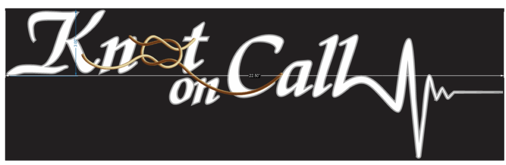
A few sample fills for this letterface before the rope is added in. This is done because the frayed ends of the ropes are blended in with the letterface (like airbrushing), before printing the boat graphic.


The original “Knot on Call” was a white 40-foot sailing catamaran owned by a physician who uses the vessel as his floating sanctuary away from the demands of his medical practice. Over time, other iterations have been drafted, say for a black boat and they are included here at the top of the page.


The design is awesome! Can you send a sample using different font for “Knot on” in 5C, 8C and 20B bolded? We would want the font to be the same thickness so it can flow with “Call” and the EKG pattern.
We like #3 the best. Would you adjust the “O” knot so it flows into the bottom of the “c”? Could you change the color to a navy blue and do one without gold outline and one with? Thanks!!! Can’t wait to finalize!
Love these decals. I would like to order one of these for our Boston Whaler. I like the first one “5. Navy with a bevel based on #3 with frayed rope ends”. Instead of Navy can we do Black?
Let me know if youd like to see a preview on the boat. Send me an email with a photo and we’ll figure out the best size.
I really like #5 and #4 would be interested in Navy if I did number 4. Would like to purchase one for my Yamaha
Kevin, got this please call 253.468.2117 or shoot me an email with a photo and dimensions or the size of the graphic you’d like.