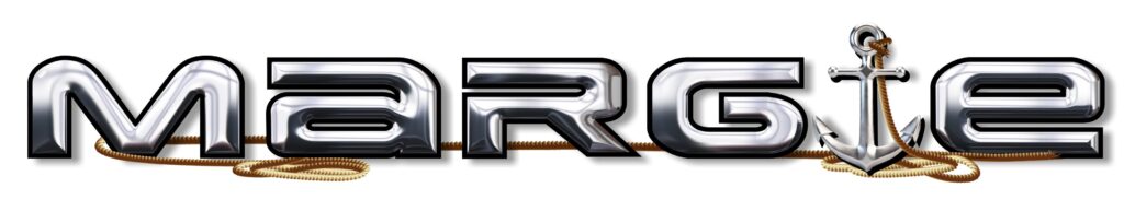
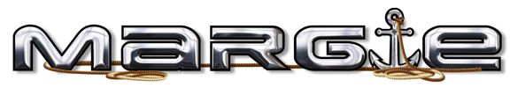
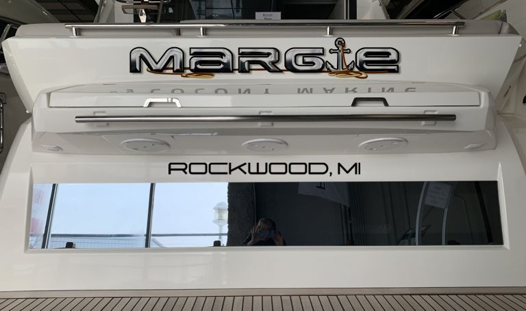
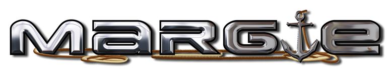
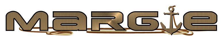
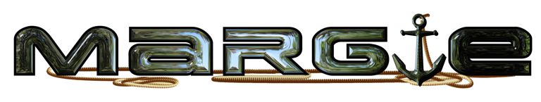
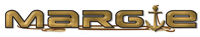
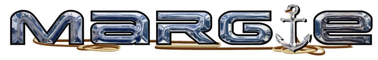
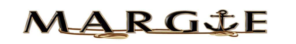
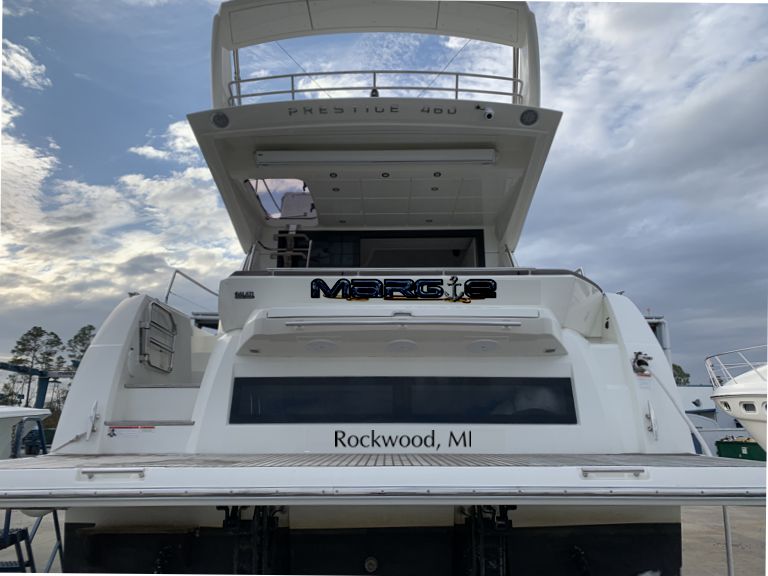
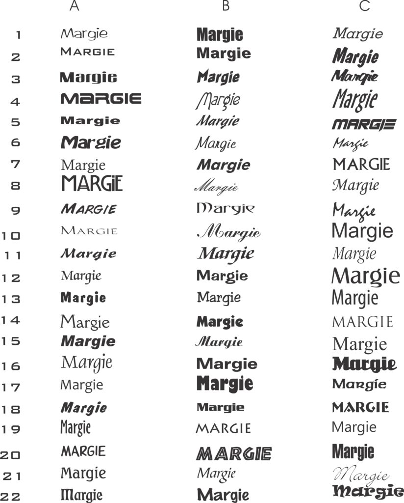
9. new chrome and anchor with drop shadow on anchor instead (gets lost from a distance)10 anchor on top woven through10 detail8. updated chrome fill and new anchor with outline8. Hull preview with new photo of my 5. more gray in the chrome with dropped shadow6. gold foil print or metallic overlay7. different chrome fill4 gold bevel with soft shadow behind letters, not rope3. letterspaced3. preview on hull2. Letterspaced black letter face and gold outline.2. on the hull1. chrome letterf ace with anchor for I and rope.1. a draft I think a little bit darker than reality, but fits it the space, centered.A type study I realized the lower case g took up too much real estate and moved toward all upper case for starters.