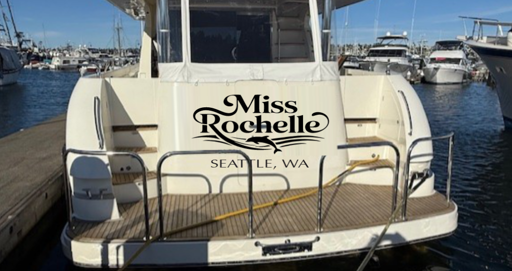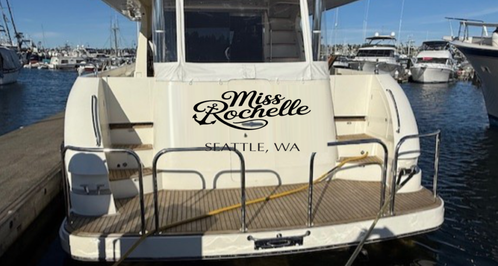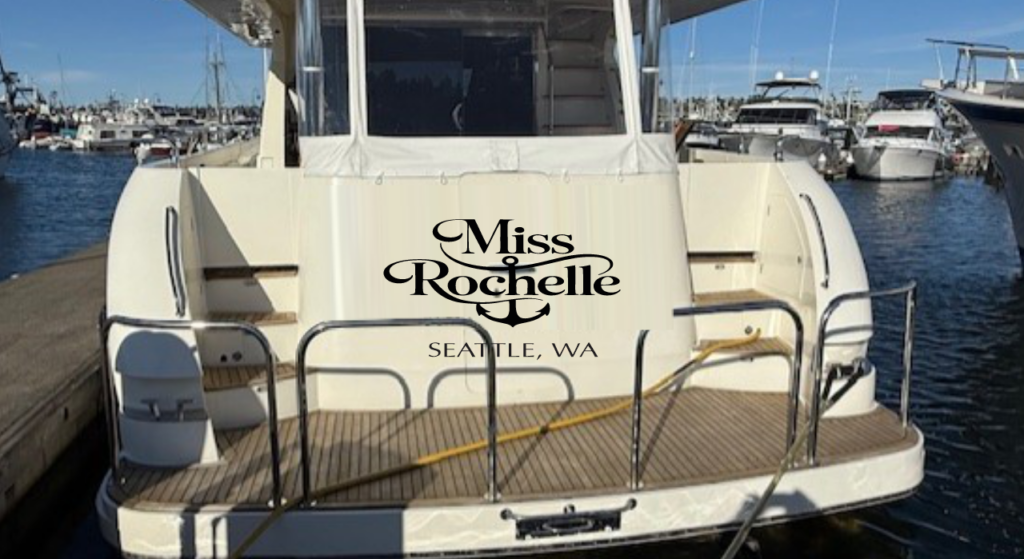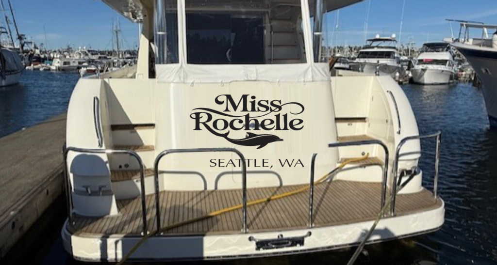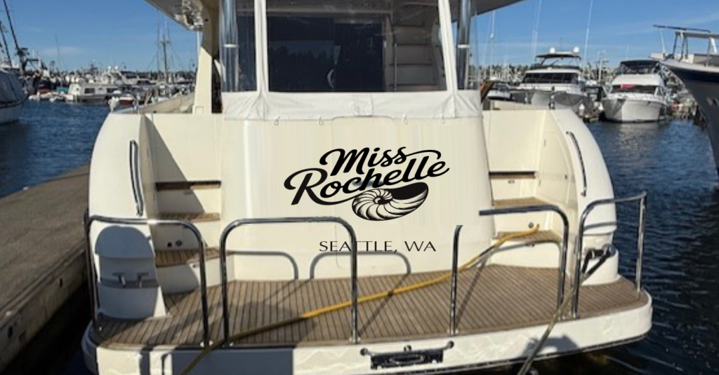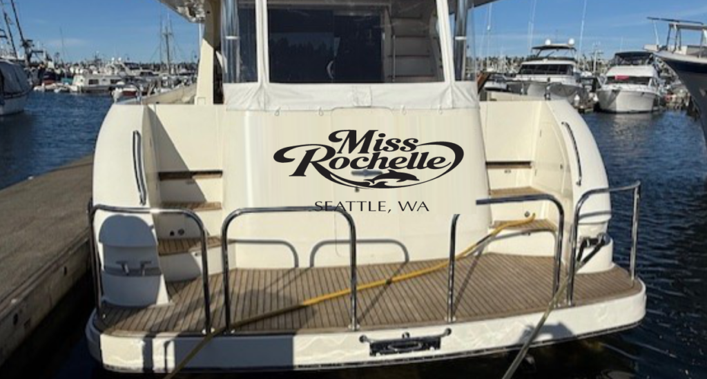
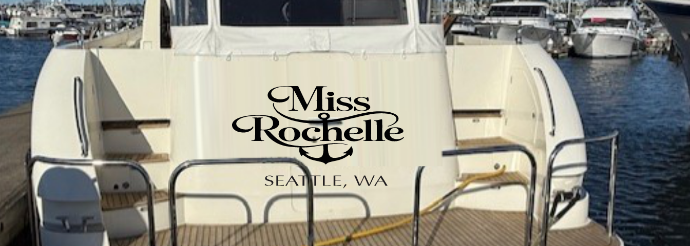
The graphics below are first drafts for an expedited boat name project. In this scenario, where time was of the essence, we came up with 6 concepts in the first round instead of three or four. Then we will take the customer’s top two favorite graphics and create additional treatments like outlines and fills to represent what additional colors could do to this one-color logo. Which are your favorites? Comment in the section below or drop an email to info@marinegraphics.com.
The first graphics are the latest based on customer input. They are numbered consecutively for identification.
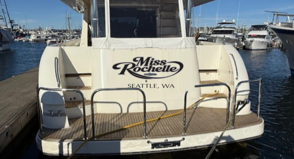
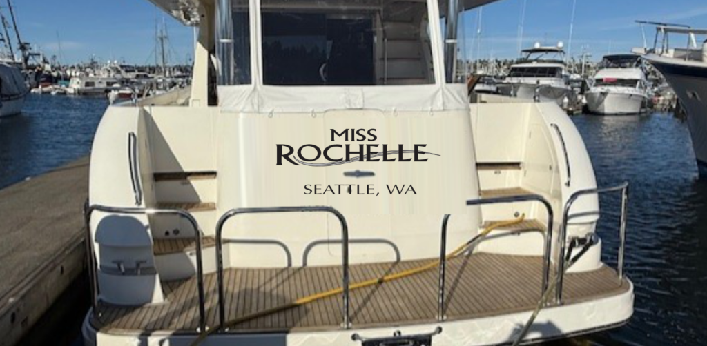
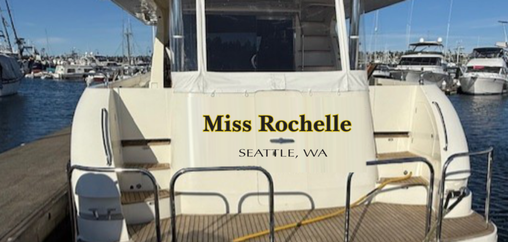
Notice the handle in the middle of the hatch. With a professional installation, the vinyl is butted and trimmed to the edge of this handle and overall, from a distance this piece of hardware barely affects the readability of the boat logos in each case.