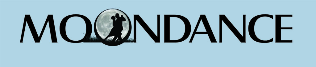
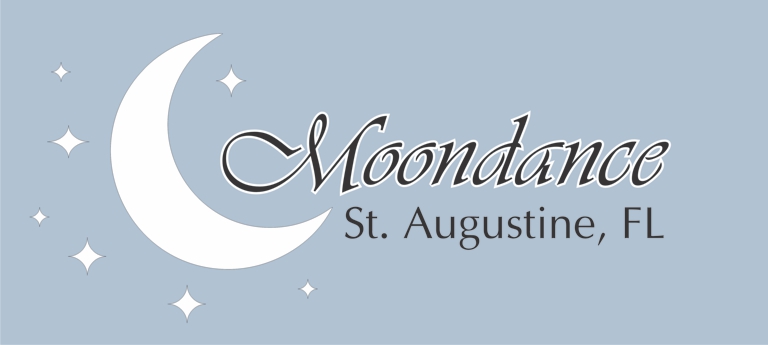
In this boat name case study, our customer provided a little background for reference. The couple’s favorite pastime, besides boating? Dancing! Here is an attempt to align that concept within the word to create something unique.
Using a full moon in the boat’s lettering as a capital “O” seems to be an obvious variation, but it’s difficult to do on a lighter hull. The illusion of light in the sky can be created with a darker cloudlike background, but in this case, a black circle around the moon helps define its use as a letter.
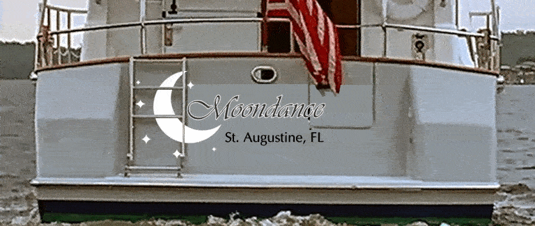
Here is an example of how this graphic might look centered and spread across the transom. Notice the break across the door between the A and N means no trimming of the vinyl is required.
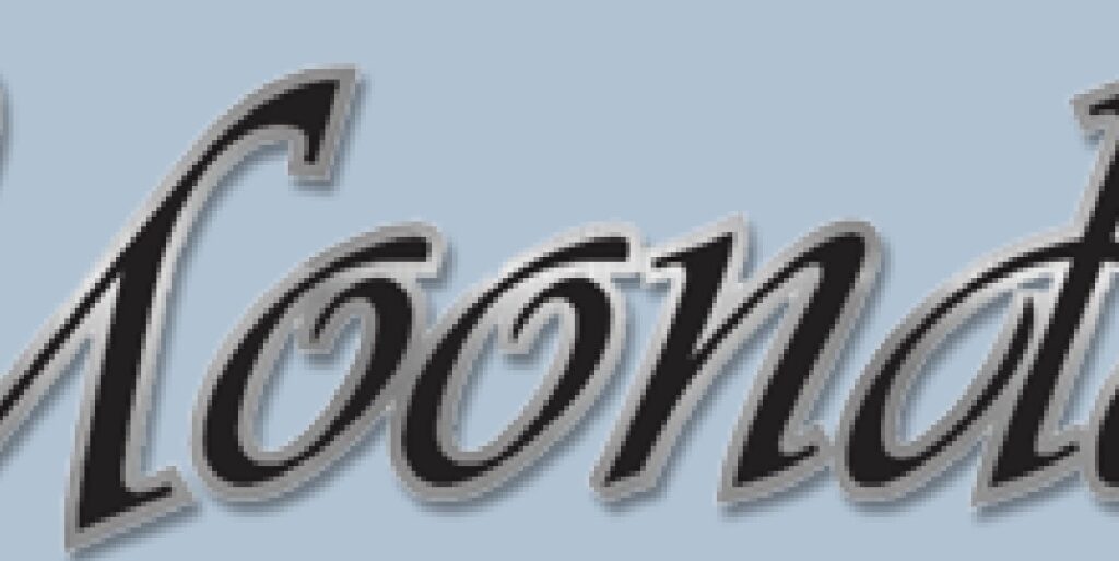
Using a silver foil outline on the letters really makes the boat name stand out against an off-white hull color.
The ladders on the port side of the vessel interfere with the original boat graphic.
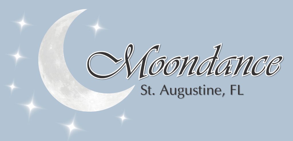
Rather than just using plain white shapes for the moon and stars this third boat graphic example uses a digital print for texture on the moon and luminance on the stars. To get the stars to “shine” like this, we blend from white to the color of the hull. You can take a photo of a white piece of paper on the gel coat in full light and we use that to create the illusion.
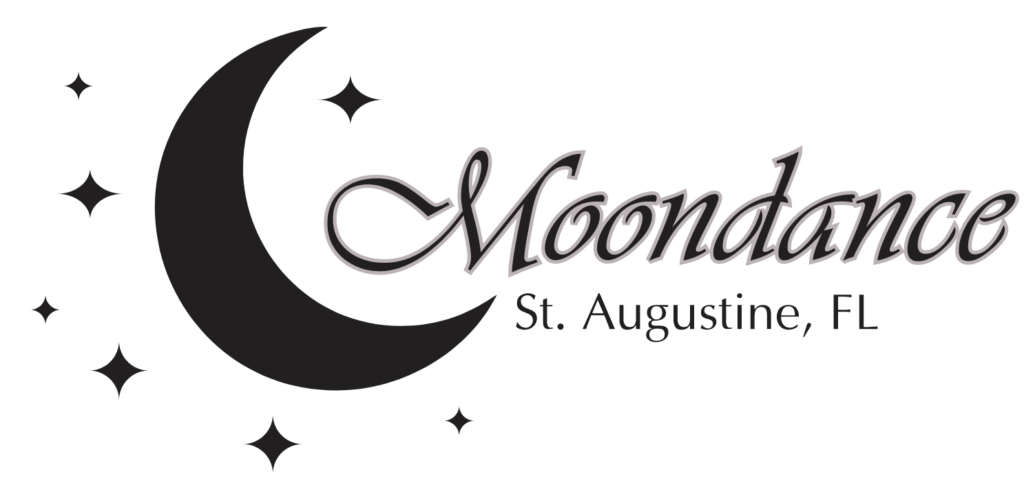
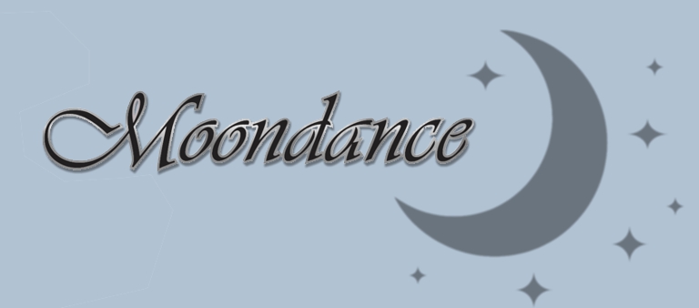
The original provided concept using a black moon and stars was our starting point.