Phase II boat graphics

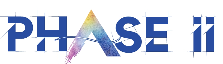
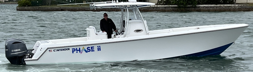
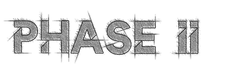
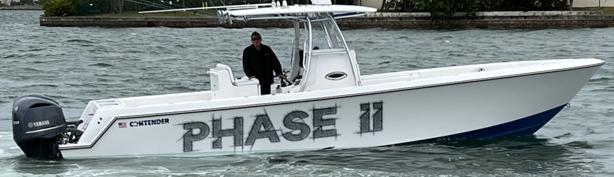
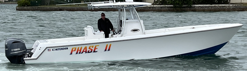
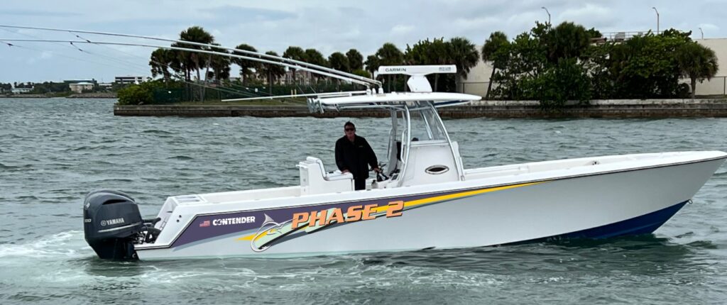
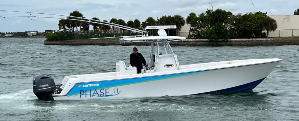
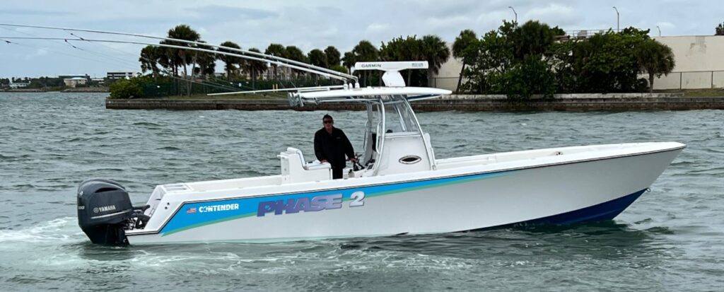
Conducting a type study not only showcases the potential of various letters and shapes we can use on your boat, but also highlights the importance of identifying what doesn’t work well. This is just as crucial as selecting your preferred options during the initial drafting stage. If you’re interested, I can provide you with examples of boat lettering concepts incorporating the alternative styles, but I started with my favorites as follows.

6. artful
6. hull preview smaller aft
5. sketched
5. printed larger like a partial wrap on clear
4. water ripples sunset
4. hull preview port and starboard
3. building the name into a stripe you would remove the Contender logo from the mfg.
3. hull preview
Adding color to the side
2. using a wave through the A
2. hull preview aft near the waterline
1. Glass bevel over fading color – “transition”
1. hull preview with a stripe added

Leave a Reply

Your email address will not be published. Required fields are marked *