


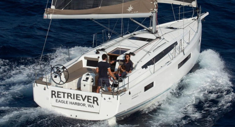

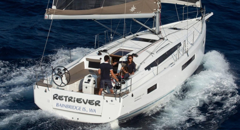


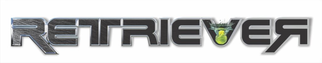

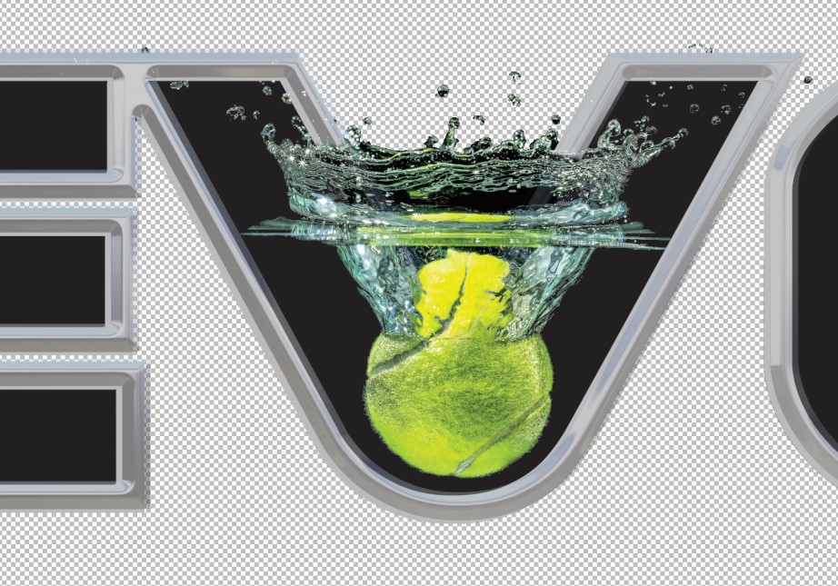
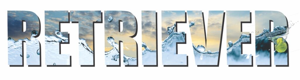


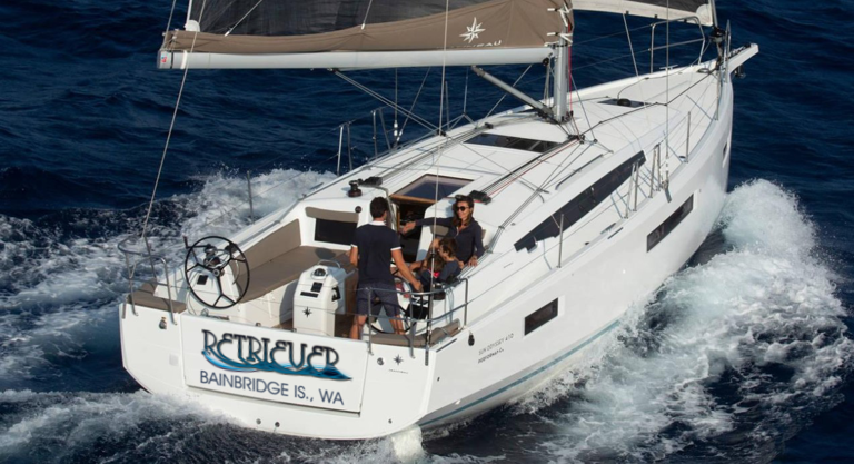
I usually start with a type study to identify interesting letters and get an idea for what’s reasonable. Normally A9 is a non starter but I noticed how the arcs under the letters crossed to make wave graphics. This led to another underwater shot with a tennis ball for the dogs. Let me know if you’d like to see any other type example, dial it back to something more traditional, color preferences for next iterations.