Sea Shags boat graphic

8. flat black face version of 6 with silver bevel outline and tuna fin breaking through
8. closeup on tuna fin. the fish could also use a yellow fin and a shadow over the S
7. black and silver version of 5 with yellow fin
6. gold beveled outline on black letter face with tuna swimming through the middle
6. hull preview with nested hailing port near tuna fin
5. variation on 1 with tuna shadow
5. hull preview
4. black bevel fill on “a20” with silver outline and marlin hook graphic
4. close up details soft shadow and outline
4. hull preview larger across bait tank
1. chrome bevel with sky and clouds using the font from “c18” above with a wave
1. hull preview constraining the boat letters to the center panel
2. black upper lower case bold with wave using “c20”
2. hull preview. This graphic also fits neatly in the center of the bait tank.
3. steel raised look
3. hull preview

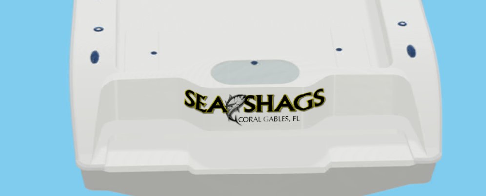
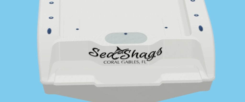
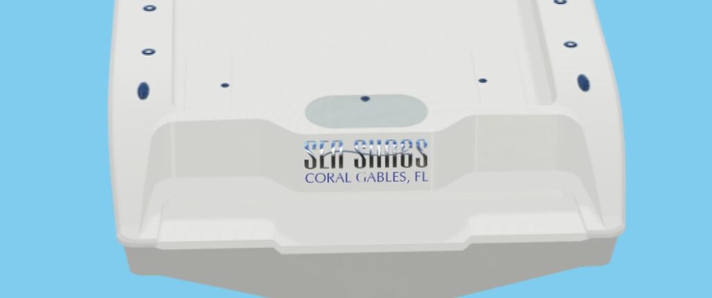
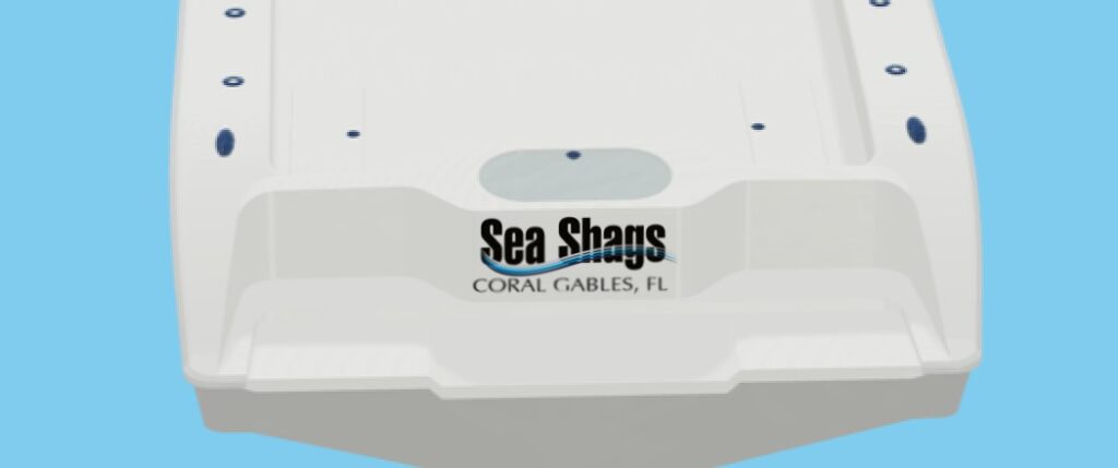
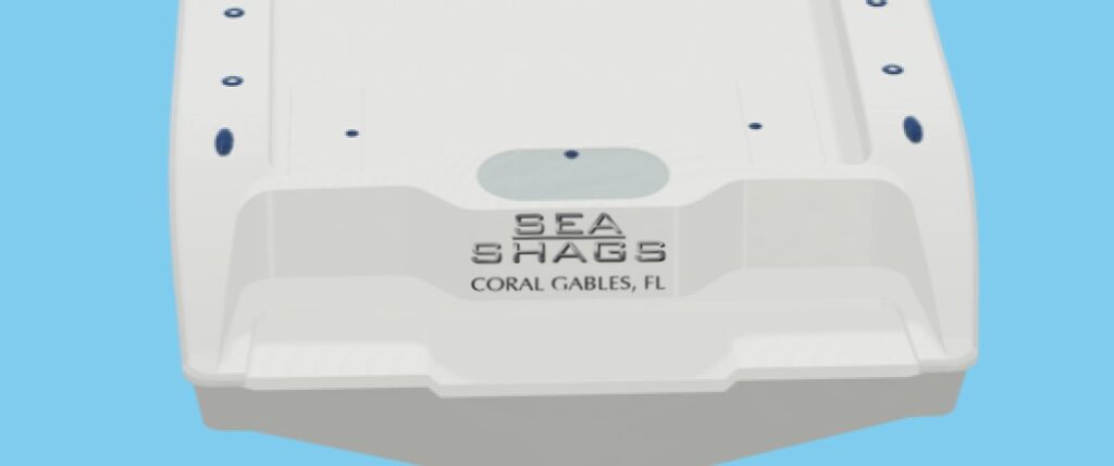
Conducting a type study not only showcases the potential of various letters and shapes but also highlights the importance of identifying what doesn’t work well. This is just as crucial as selecting your preferred options during the initial drafting stage. If you’re interested, I can provide you with examples of boat lettering concepts incorporating the alternative styles depicted above. I start with my favorites as seen above.

One comment

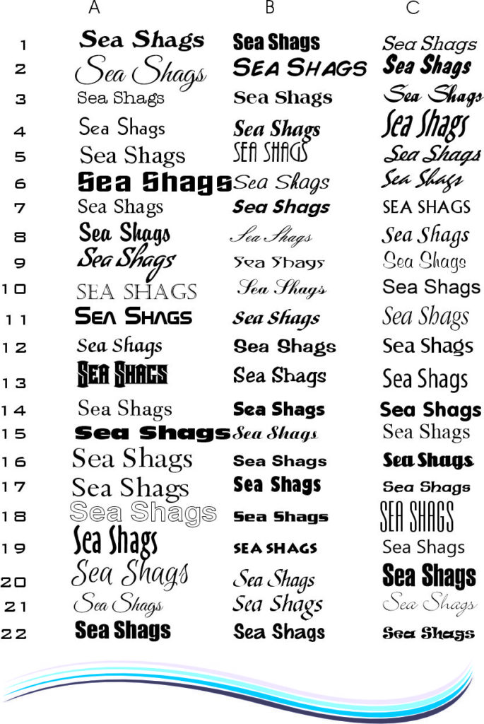
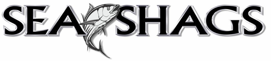
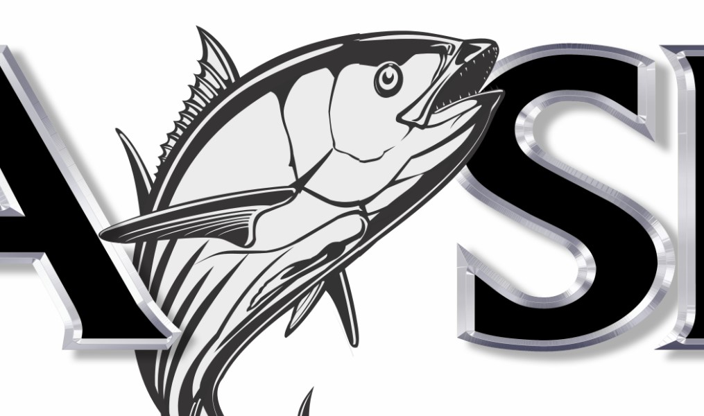
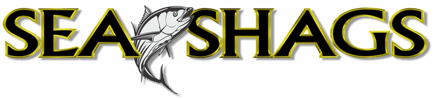
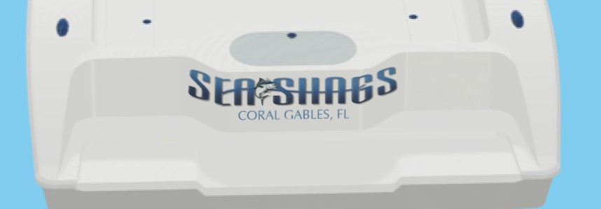
  1. Really like the last one with the Marlin and hook. Just to see how it would look, can you do one with a Tuna to match it being a Yellowfin boat, just see how it looks. Also open to any others you can come up with along those lines with a fish and/or similar fishing graphics either before, in the middle (as in this one) or after name. Thank you again! #review

Leave a Reply

Your email address will not be published. Required fields are marked *