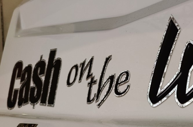
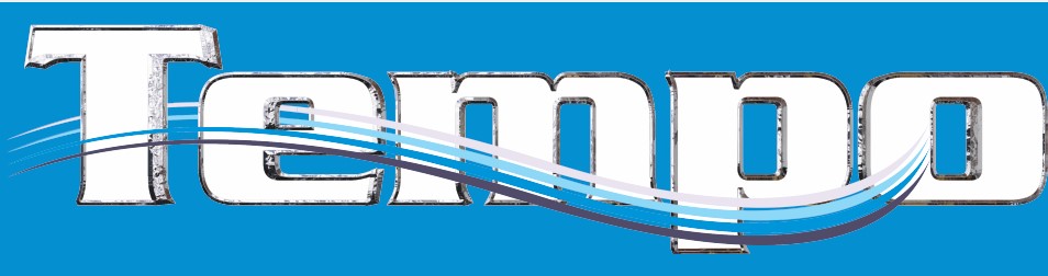
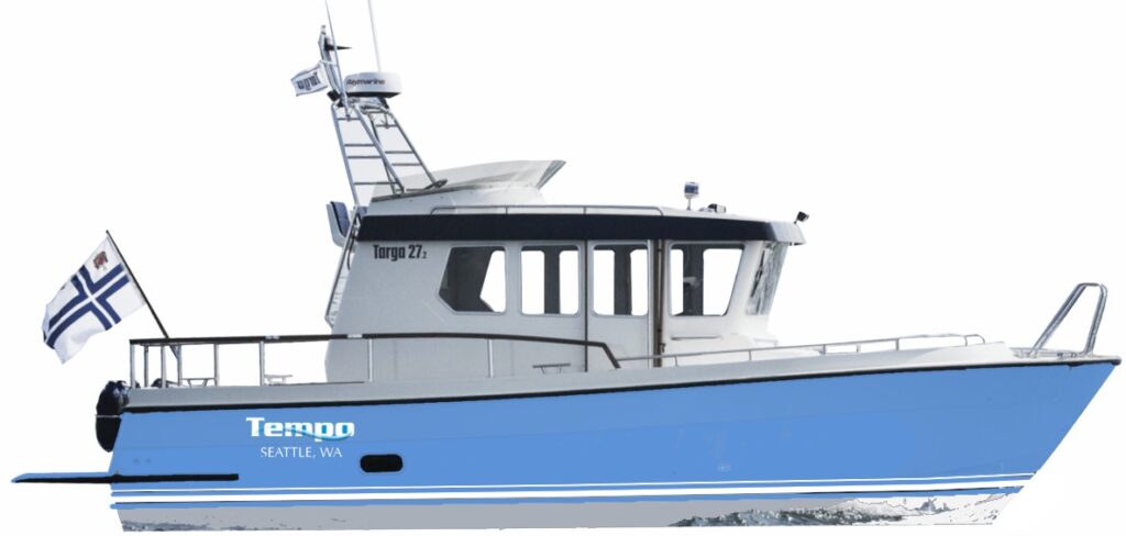
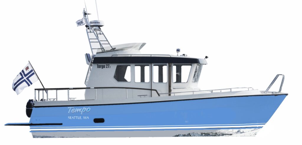
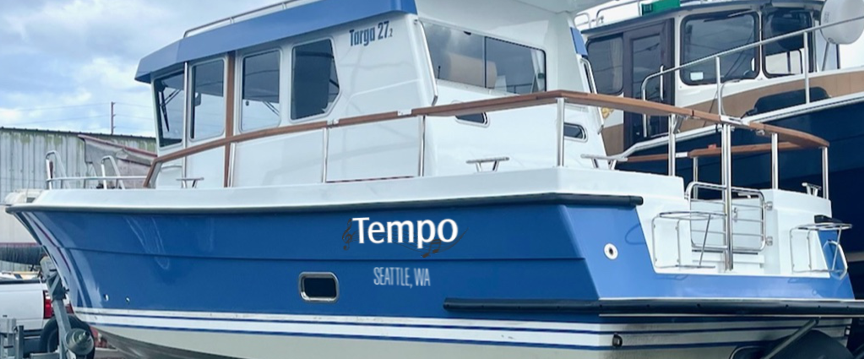
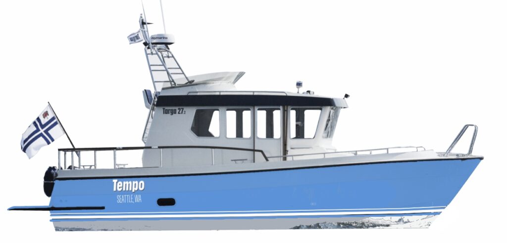
8 hull preview8. silver wave black drop shadow7. hull position closer level with waterline, not chine7. thicker/thinner with opposing waves for port and starboard.7. I was thinking of a very thin silver as we see here “on the”5. nugget extrusion and off-center wave.4. wave flowing through white I would probably like to see outlines as used on some of the examples below as a next step. A black dropped shadow would help with contrast/readability.4. hull preview. Letters are level to the waterline3. bevel on blue face with black dropped shadow for contrast3. hull preview mounted at angle.1. using the Targa typeface and a black drop shadow.2. Musical references with a wavy staff2. variation on the outline using a silver foil overlay2. hull preview1. Position on the hull with a slight rake forward on port and starboard. This is a matching style to the Targa logo3. favorites from type study