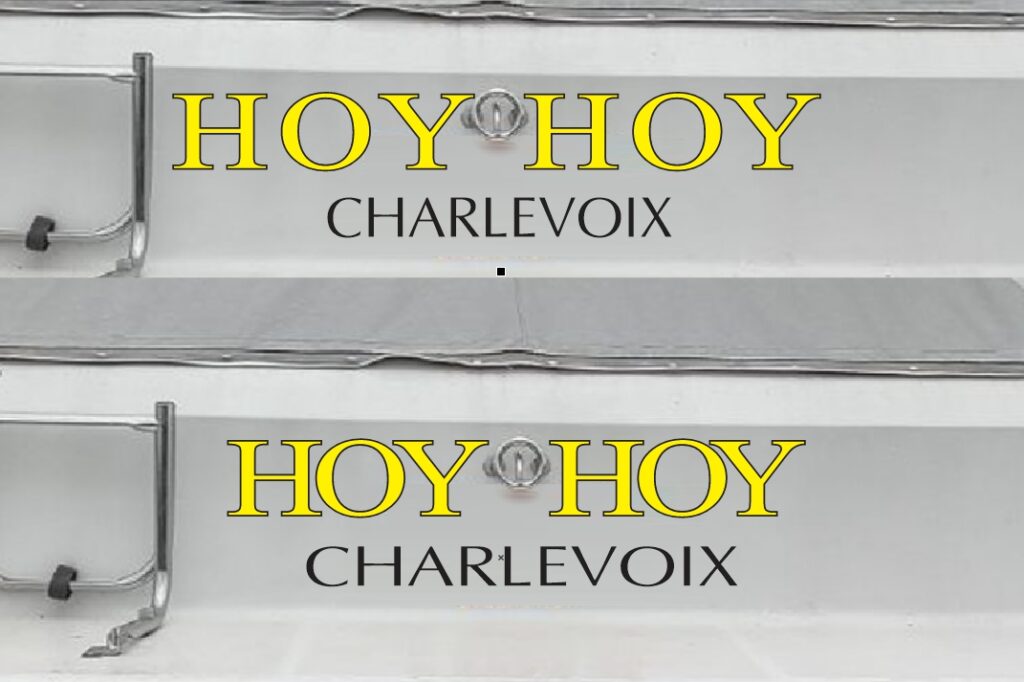


Two examples of how we might work around the two hook. The top is “letter spaced” the lower is “word spaced”. Notice also the hailing port stretches lengthwise in the lower example as another option.


Two examples of how we might work around the two hook. The top is “letter spaced” the lower is “word spaced”. Notice also the hailing port stretches lengthwise in the lower example as another option.


