Watercolors boat graphics

9. smaller palette and water-fill bevel
9. close up on edit – added a shadow under the brush and palette
9. closeup
9. hull preview, the light blue picks up the interior color
8. The background from #1 with the type from #4
8. hull preview
6 and 7 – I had a couple more ideas like this I wanted to share
5. Palette adjustments less colors and brushes, rotated
4. brush script with watercolor fill and palette as a branding logo
4. hull preview could get away with printing on either white or clear.
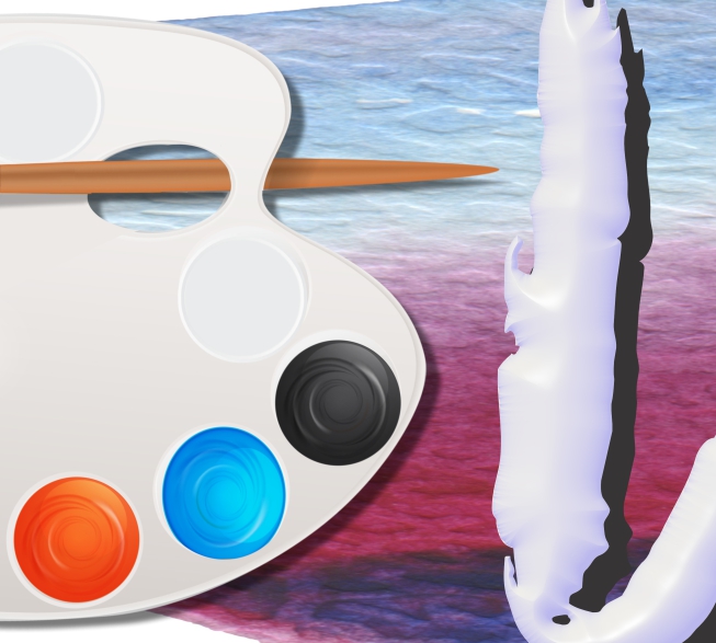
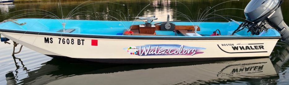
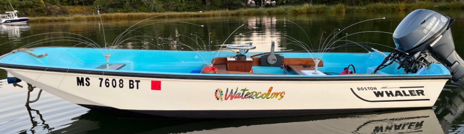
only the palette would darken if printed on clear
1. silver blues and reds preserved printed on white
1. hull preview the image stands off from the Hatteras white (warm tone) hull
2. using a clear print for this because of the trailing detail
2. This blends in again the background and works because these are darker blues

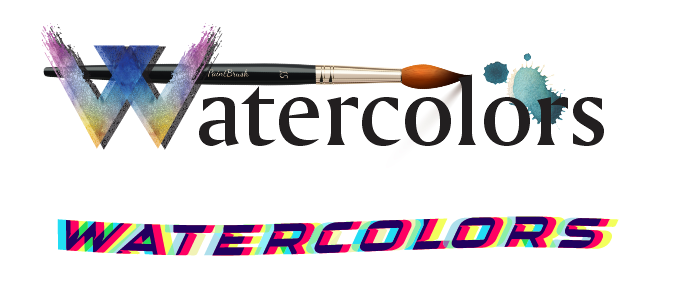
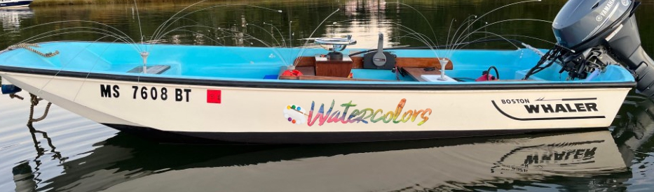
For number 3 this is really more of a concept, I don’t really like the fill but wanted to show a photo transitioning to a painting as a fill. I could easily subsitute a different photo with a different color profile. This color profile neceesitates its printing on white because of the lighter colors.

3. The concept of left to right transition from photo to painting.
3. hull preview also printed on white

Leave a Reply

Your email address will not be published. Required fields are marked *